ODBD Gladiolus – You Bless Me – ODBDSLC276

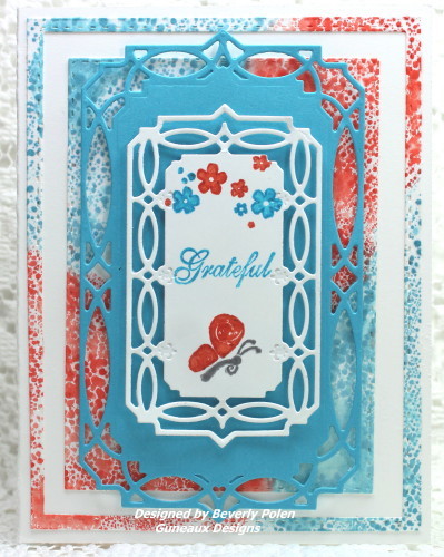
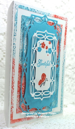
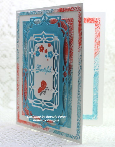
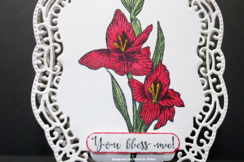
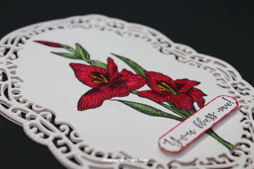
Gladiolus flowers are so beautiful, and they come in a large array of colors.  The Gladiolus flower was my Mom’s favorite flower.  When I saw the Gladiolus stamp from the ODBD Gladiolous – You Bless Me stamp set, I immediately thought of her.  So this card is in memory of her.

ODBD Gladious - You Bless Me

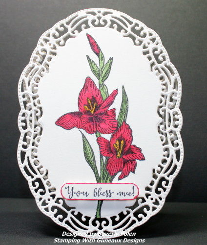
This card will be submitted to Our Daily Bread Designs for it’s July challenge, ODBDSLC276, Anything that Grows with ODBD.  The challenge requires the use of at least one stamp from either ODBD, North Coast Creations, or Artistic Outpost.  This card is created with two ODBD products; the frame die cut and the red Gladiolus stamp.

ODBD Gladious - You Bless Me
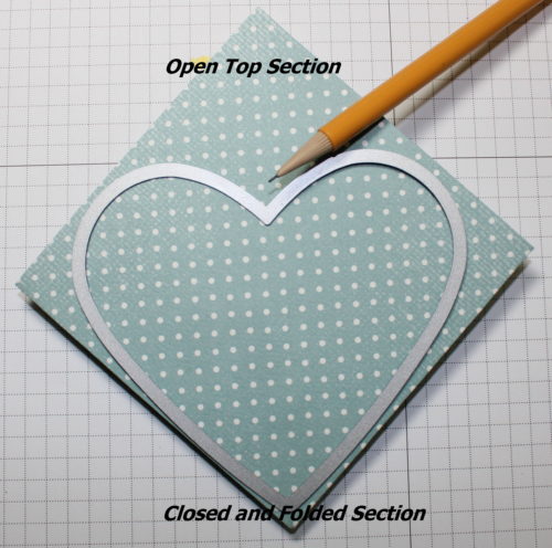
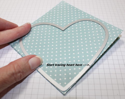
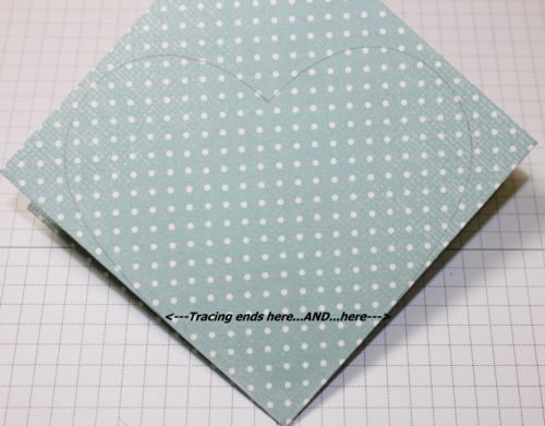
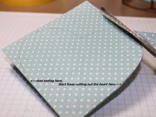
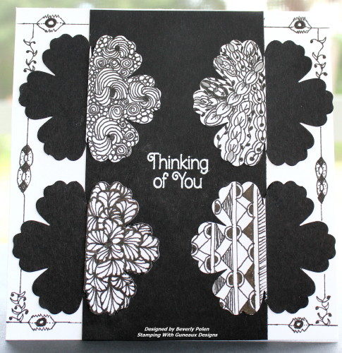
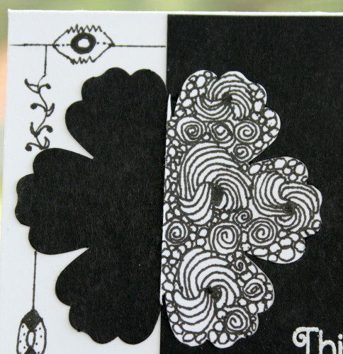
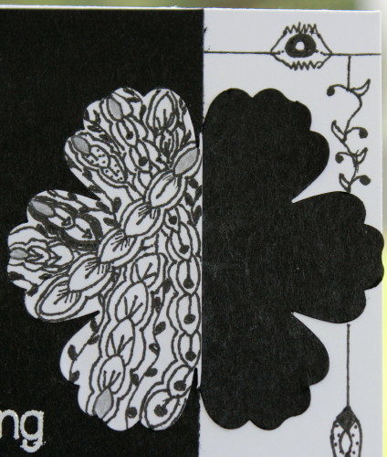
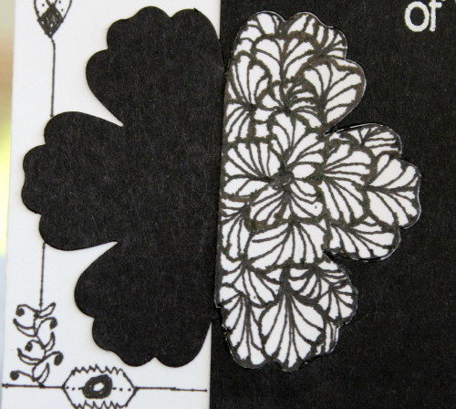
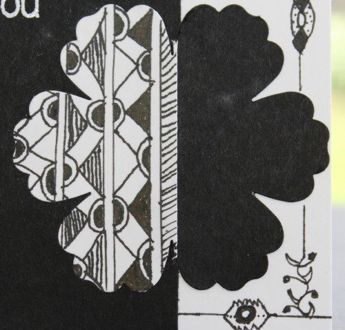
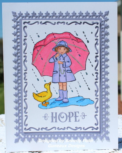
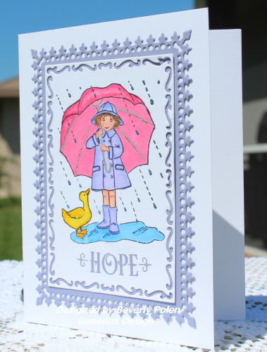
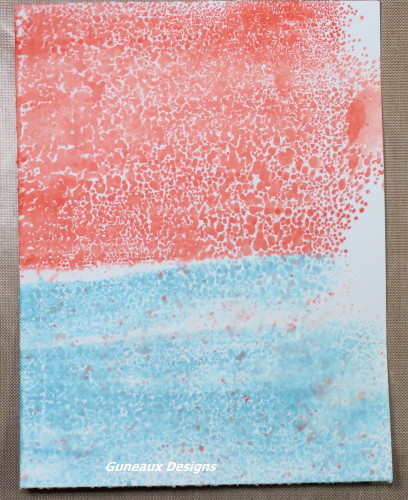
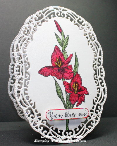
I submitted this card to the Splitcoaststampers Ways to Use It Challenge.  The challenge was to create a card and “decorate all the way to the border. Add lace to the edge, color to the edge, stamp off the edge, die cut your card with a fancy die cut whatever you do go all the way to the border.”  Therefore, I used the largest die from the ODBD Vintage Border Dies to create my card in the form of the die.

ODBD Gladious3_1
I also submitted the card for two other Splitcoaststampers Challenges: 1) F4A334, “add some sort of frame (it can be diecut, punched, stamped, embossed, etc.) to your lovely creation” . Because my card is made in the form a frame die, I decided to submit the same card for this challenge.  2) IC554, Petals, which was to draw inspiration from a website full of gorgeous floral arrangements.

If interested, you may read all the wonderful Splitcoaststampers comments on this card HERE.  You will note that the card was selected as a Favorite For The Week Ending 7/17/16, as well as a CAS (Clean and Simple) favorite.

ODBD Gladious4_1

Thanks for stopping by and I hope you have a blessed day!


SUPPLIES: 

STAMPS:  ODBD You Bless Me (you can get the Gladiolus stamp by itself or in a stamp set with sentiments; click on the photos below)

PAPER:  Neenah Solar White

INK: Memento Tuxedo Black, Copic Sketch Markers

ACCESSORIES: ODBD Vintage Borders Dies (click on photo below), SU Word Window Punch

GLADIOLUS  YOU BLESS ME VINTAGE BORDERS DIES


SU Fifth Avenue Floral

God’s Blessings!

Stamping With Guneaux Designs By Beverly Polen


[Jesus said,] “But I tell you who hear me:  Love your enemies, do good to those who hate you, bless those who curse you, pray for those who mistreat you.  If someone strikes you on one cheek, turn to him the other cheek, turn to him the other also.  If someone takes your cloak, do not stop him from taking your tunic.”  Luke 6:27 – 29 (NIV)


Explosion Heart Card

Hola, my friends!  I have for you today an Explosion Heart Card!  Have you ever made one?  This is my first time, and I made it for a Technique Lovers Challenge on Splitcoaststampers.

If you are a Stampin’ Up! (SU) consumer, do you remember this gorgeous Parisian Breeze Specialty Designer Paper (retired)?  It came out in 2009 and is a heavy double-sided Designer Series Paper (DSP).  The colors of the DSP are Baja Breeze, Chocolate Chip, and Kraft.  I used the paper to create my Explosion Heart Card!  This photo is the card closed with a ribbon.

Explosion Heart Card

This is the card’s inside after it “explodes”.  LOL

Explosion Heart Card

And, this is a photo of the lovely SU Parisian Breeze Specialty Designer Paper.

parisian_breeze


UPDATE:  This card was selected as a Splitcoaststampers Favorite for the Week Ending July 17, 2016!


Here are the steps for creating an Explosion Heart Card:

  • Cut an 8-1/2″ square piece of the DSP (or card stock).
  • Score and fold the paper in half.
  • Unfold, score, and fold in half in the opposite direction.
  • Score and fold two corners together to form a triangle.

The first photo is the outside of the DSP after all of the folding, and the second photo is of the inside.

Explosion Heart CardExplosion Heart Card2


  • Using your finger, push in the two corners of the triangle just created.

Explosion Heart Card3

Explosion Heart Card4Explosion Heart Card5

  • Using a heart shaped die or framelit (I used the next to the largest Stampin’ Up!’s retired heart framelits), lay it onto the folded DSP to trace the heart onto the paper.
  • Place the die/framelit close to the bottom closed portion of the DSP, ensuring the open section is at the top.

Explosion Heart Card7Explosion Heart Card8

  • NOTE:  Don’t trace the very bottom of the die/framelit as the bottom must stay folded and uncut.
  • Ensure your tracing starts and ends as shown.

Explosion Heart Card9

  • Using scissors, cut out the heart ensuring you’re cutting through all the layers.

Explosion Heart Card10Explosion Heart Card11Explosion Heart Card12

  • Decorate the outside and inside of your card as desired.  I added a ribbon to ensure the card stays closed.  If you add a ribbon, add it to the top heart BEFORE you adhere any decoration (e.g,. cardstock, etc.) to that heart.  Refer to the second photo above to see where my ribbon was added.
  • Enjoy your card!

If the instructions are confusing, PLEASE feel free to leave me a question or comment in the comments section or by email (address is in the header of the page).


SU Fifth Avenue Floral

God’s Blessings!

Stamping With Guneaux Designs By Beverly Polen

“The Lord says: “These people come near to me with their mouth and honor me with their lips, but their hearts are far from me. Their worship of me is based on merely human rules they have been taught.”  Isaiah 29:13

Sweet Seasons

I have a card to share that features the old Stampin’ Up! Sweet Seasons Stamp Set that was released in 2004!  I’ve had this set for ten years and never used it until I was searching for a stamp to create a beach scene.  I had forgotten about the Sweet Seasons Stamp Set, and glad I stumbled upon it!

Sweet Seasons Stamp Set

The reason I was searching for a beach scene stamp was to participate in yesterday’s Splitcoaststampers Clean And Simple (CAS) Challenge to “Hit the Beach”, CAS385.  This challenge is hosted by Kathleen Curry, who wanted to “see a beachy card from everyone” who chose to participate in the challenge.

I chose the little girl image from the Sweet Seasons Stamp Set because it reminds me of my very precious granddaughter who loves the beach.  Needless to say who will receive this card!!

This photo provides a closeup of the image.  Because I live on the west coast of Florida and the sand on the beaches are more white, my sand in the image is Brick White (Copic Sketch Marker E40).

Sweet Seasons2

I designed the card with four layers of card stock, of which three are frames.  The white frame is smaller than the Rich Razzleberry (Stampin’ Up! card stock) frame, and the Wild Wasabi (Stampin’ Up! card stock) frame is larger than the Rich Razzleberry frame.  To create the frames, I used Our Daily Bread Designs (ODBD) Double Stitched Squares Dies.

I like the card, and I’m sure so will my granddaughter!


SUPPLIES:

Stamps:  Stampin’ Up! Retired Sweet Seasons Stamp Set and ODBD North Coast Creations Little Birdies (for the sentiment)

Paper:  White Linen Card Stock (Essentials by Ellen),  Neenah Solar White Card Stock, Stampin’ Up! Rich Razzleberry Card Stock, and Stampin’ Up! Wild Wasabi Card Stock (Stampin’ Up! Store)

Card Size:  4-1/2″ Square

Ink:  Various Copic Sketch Markers

Accessories:  Our Daily Bread Designs Double Stitched Squares Dies

Sweet SeasonsLITTLE BIRDIESDOUBLE STITCHED SQUARES DIES


SU Fifth Avenue Floral

God’s Blessings!

Stamping With Guneaux Designs

“I am the vine; you are the branches.  If a man remains in me and I in him, he will bear much fruit; apart from me you can do nothing.  If anyone does not remain in me, he is like a branch that is thrown away and withers; such branches are picked up, thrown into the fire and burned.”  John 15:5-6

Zentangle & Japanese Notan

Zentangle & Japanese Notan

Hello, my friends!!  Before I discuss my card share today, I need to provide you with definitions for Zentangle & Japanese Notan.

Zentangle is a noun, not a verb!  It is the resulting art of creating beautiful images by drawing structured patterns.  When you create a Zentangle, you are “tangling”, which puts you into a “Zen” frame of mind.  The art method is easy and uplifting.  The tangling on my card is in the white sections of the card.

Japanese Notan is a guiding principle of Eastern art and design.  It is a Japanese word meaning dark-light, and it focuses on the interaction between positive and negative space, and embodies the ancient symbolism of the Yang and the Yin. It recognizes the separate but equally important identity of both a shape and its background.

Now, here’s my card:

Zentangle & Japanese Notan

I prepared the card in response to two Splitcoaststampers Challenges.  One challenge was to create using the Japanese Notan method of art for the Mix-Ability Challenge.  The other was to create in black and white for the Inspiration Challenge.  For the Inspiration Challenge, participants were to visit this Pinterest Board and draw inspiration from the board’s images.

This image was my inspiration.  As soon as I saw the gorgeous Zentangle boot, I knew it would be my pick!  Thus, I combined the two challenges to create my card.  :

To create the Japanese Notan portion of the card, I used the retired Stampin’ Up! Blossom Punch to cut four half blossoms from a piece of  black card stock.  I laid and glued these four pieces to the sides of the related white half blossoms.  I then used different tangling patterns to fill in the white space.  Typically, there would only be white opposite of the black for the Notan technique; however, because I combined the two challenges, I used the white space to tangle and to create my Zentangle & Japanese Notan card.  I hope you enjoy it.

Zentangle-Notan3_1 Zentangle-Notan4_1 Zentangle-Notan5_1 Zentangle-Notan6_1

BlogDivider_zpsed339ea1

SU Fifth Avenue Floral

God’s Blessings!

Stamping With Guneaux Designs By Beverly Polen

“In that day you will no longer ask me anything.  I tell you the truth, my Father will give you whatever you ask in my name.  Until now you have not asked for anything in my name.  Ask and you will receive and your joy will be complete.”  John 16:23 & 24

ODBD Grace’s Hope

Happy Monday!!  Hope everyone had a blessed weekend!  Today’s card share features two different  and new Our Daily Bread Designs (OBDB) products: 1)  ODBD Grace’s Hope Stamp Set (1715) and 2) ODBD Lavish Layers Dies.  Also featured is a retired Stampin’ Up! Stamp Set, the And Everything Nice.

ODBD Grace's Hope

Isn’t she so pretty?  I have had this stamp of the little girl in the rain since it came out in 2005; however, I had never used it until today!  Eleven years she was stuck inside her plastic container.  Shame, shame!!  LOL

I used the new ODBD Lavish Layers Dies to cut the two frames showing on the card. Isn’t the design of these dies gorgeous?   I love the new dies!  They are very intricate but cut so well.  The card’s sentiment “HOPE” is from the ODBD Grace’s Hope stamp set. If you’ve not tried Our Daily Bread Designs products, I strongly recommend them to you!


Let me share about the name of the stamp set, Grace’s Hope.  Grace Nywening is a sweet lady who is a former Design Team Coordinator and current DT member of Our Daily Bread Designs Company.   She is undergoing a very powerful chemotherapy treatment course for Breast Cancer.  ODBD decided to honor Grace by dedicating to her the Special Edition Anniversary stamp sets for 2016!  Grace’s Hope is one of the stamp sets.  If you believe in prayer, please add her to your prayer list.  Thank you!


Back to the card.  I am submittimg this card to Splitcoaststampers for it’s Clean and Simple Challenge, CAS371 – APRIL SHOWERS.  The challenge requirements are:  “You know the old saying…April showers bring May Flowers?  Well, today it’s all about those April Showers! The challenge is to use a watery image/element on your project.”  When I read the challenge, the little girl stamp immediately came to my mind.  FINALLY, I decided to use the stamp for my image on the card!

ODBD Grace's Hope

I hope you enjoy my little girl!!

BlogDivider_zpsed339ea1

Stamps:   ODBD Grace’s Hope Stamp Set (1715) and Stampin’ Up! (SU) And Everything Nice

Paper:  SU Whisper White and Wisteria Wonder

Card Size:  A2

Ink:  Copic Markers

Accessories:  ODBD Lavish Layers (CBD149) and Copic Markers

Technique:  Coloring with Copics

These are pictures of some of the products I used.  Click on the above links, not the pictures, to access the products:

ODBD GRACE'S HOPEODBD Grace's Hope - LAVISH LAYERS DIESODBD Grace's HopeWisteria Wonder 8-1/2 x 11 Cardstock by Stampin' Up!

BlogDivider_zpsed339ea1

Swallowtail Butterfly

God’s Blessings!

 Stamping With Guneaux Designs By Beverly Polen

“He gives strength to the weary and increases the power of the week.”  Isaiah 40:29

Splitcoaststampers Color Challenge, CC576

Splitcoaststampers has a Color Challenge, CC576, posted here today, and the colors being featured are Tempting Turquoise, Tangelo Twist, and Whisper White.  What do you think about Tempting Turquoise and Tangelo Twist together?  At first I was hesitant about the colors, but after I began creating, I realized how well they go together.  BTW,  I do not have any Tangelo Twist, so I substituted Tangerine Tango.

This is the card I made for the Splitcoaststampers Color Challenge, CC576:

Splitcoaststampers Color Challenge, CC576

(Update:  This card was chosen as a Splitcoaststampers’ favorite.)

These are the steps I took to make the card:

  • I began the card by spreading Tim Holtz’s Distress Ink – Broken China and Ripe Persimmon – (close to Tempting Turquoise and Tangerine Tango) onto my Rangerink non-stick craft sheet, being careful to not blend the colors.
  • Then I spritzed the craft sheet with water mist until bubbles formed.
  • I cut a 4″ x 5-1/4″ piece of Whisper White card stock and laid it, front side down, onto the ink.
  • I slightly, very slightly, touched the back of the card stock in several places to ensure ink transferred to the card stock.
  • I used the heat gun to ensure it was dry.

This photo is my first try.  Somehow, I don’t know how, I got the orange mixed into the blue.  Needless to say, that piece went into the trash and I started over following the above steps.

Splitcoaststampers Color Challenge CC576

  • After achieving the color mixture I wanted, I used Our Daily Bread Designs (ODBD) two largest Double Stitched Rectangles Dies (CBD123) to cut out three die cuts.
  • I only used the largest and smallest die cuts to adhered to the front of a Whisper White (thick) card stock, as shown in the following photo.

Splitcoaststampers Color Challenge, CC576

  • Next, I added adhesive foam to two frames, Tempting Turquoise and Whisper White, made with the Spellbinders Nestabilities Astoria Decorative Element Dies (S5-254)
  • Before adding the Whisper White frame, I stamped the images onto the frame.
  • I adhered the third frame die cut that I mentioned above to the inside of the card as shown in the below photo.

Splitcoaststampers Color Challenge, CC576

Enjoy and thanks for stopping by!

BlogDivider_zpsed339ea1

SUPPLIES USED:

Stamps:  Studio g Blessed
Paper:  SU Whisper White, Tempting Turquoise, and Tangerine Tango Card Stock
Card Size: A2
Ink:  Tim Holtz Distress Ink and SU Tempting Turquoise and Tangerine Tango
Accessories:  Double Stitched Rectangles Dies (CBD123), Spellbinders Nestabilities Astoria Decorative Element Dies (S5-254), and Rangerink Non-Stick Craft Sheet

BlogDivider_zpsed339ea1

Swallowtail Butterfly

God’s Blessings!
Stamping With Guneaux Designs by Beverly Polen

“Come to me, all you who are weary and burdened, and I will give you rest.” Matthew 11:28