Stampin Up Morning Meadow Hostess Stamp Set

I have for you a quick and simple Thank You card that you can create in about ten minutes. The card features the new Stampin’ Up! Morning Meadow Hostess Stamp Set that can be purchased for $10 with a qualifying order.

Stampin Up Morning Meadow Hostess Stamp Set

Supplies for the Stampin Up Morning Meadow Hostess Stamp Set Thank You Card:

Stamp Set: Stampin Up Morning Meadow Hostess Stamp Set (129678)

Stampin Up Morning Meadow Hostess Stamp Set

Paper: Crisp Cantaloupe Card Stock (131298), Baked Brown Sugar Card Stock (131296), and Whisper White Card Stock (100730)

Ink: Crisp Cantaloupe Classic Ink (131176) and Baked Brown Sugar Classic Ink (131174)

Accessories: Apothecary Accents Framelits (127003), Pearl Basic Jewels (119247), Stamping Sponges (101610), and Adhesive of your choice

Stampin Up Morning Meadow Hostess Stamp Set

Instructions for the Stampin Up Morning Meadow Hostess Stamp Set Thank You Card:

1. Cut an 8-1/2″ x 5-1/2″ piece of Crisp Cantaloupe card stock and fold in the middle for the card base.

2. Cut a 5-1/4″ x 4″ piece of Baked Brown Sugar card stock and sponge the edges with matching ink.

3. With the small rectangle accent from the Apothecary Accents Framelits, cut an accent from Crisp Cantaloupe Card Stock. Sponge the edges with matching ink.

4. Lay the rectangle accent on a small piece of Whisper White Card Stock and trace along the INSIDE of the accent. Cut out the accent and stamp on it the sentiment, “Thank You”, in Baked Brown Sugar Classic Ink (the sentiment is also from the Morning Meadow Hostess Stamp Set). Sponge the edges with Crisp Cantaloupe Classic Ink.

5. Lay the rectangle accent onto a small piece of Baked Brown Sugar Card Stock and trace along the OUTSIDE of the accent. Cut out the accent and sponge it with matching ink.

6. Cut a 5″ x 3-3/4″ piece of Whisper White Card Stock. Ink the floral stamp from the Morning Meadow Hostess Stamp Set with Crisp Cantaloupe Classic Ink. Randomly stamp the image around the edges of the card stock (I stamped the image twice before re-inking). Sponge the edges with Crisp Cantaloupe Classic Ink.

7. Adhere the Baked Brown Sugar Card Stock to the card base.

8. Adhere the Whisper White Card Stock to the Baked Brown Sugar Card Stock.

9. Adhere the Baked Brown Sugar Card Stock accent onto the center of the Whisper White stamped card stock.

10. Adhere the Whisper White accent with the sentiment onto the Crisp Cantaloupe accent.

11. Add foam adhesive to the back of the of the sentiment and mat, and adhere it to the Baked Brown Sugar accent.

12. Use a permanent peach marker to color two pearls and add them to the sentiment.

13. Randomly adhere the smallest pearls in the center of some of the flowers.

There is so much more that could be added to this card, and the colors certainly can be substituted. You may want to change the center piece with the sentiment by using other framelits and sentiments. Regardless, ENJOY!

God’s Blessings!
Stamping With Guneaux Designs
by
Beverly Polen 

Morning Meadow Hostess Stamp Set

STAMPIN UP MORNING MEADOW HOSTESS STAMP SET

Papillon Potpourri Stamp Set – Stampin’ Up!

Papillon Potpourri Stamp Set – Stampin’ Up!

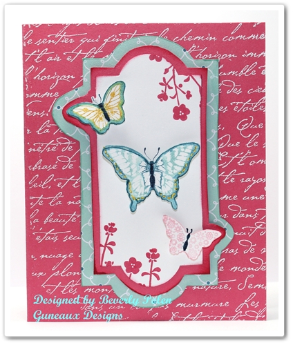
Today’s greeting card features the Papillon Potpourri Stamp Set – Stampin’ Up!(123759 – catalog item number – clear mount).  I love butterflies, so the Papillon Potpourri is one of my favorite stamp sets.

The card base is made with a piece of the new In-Color Strawberry Slush Card Stock.  Using VersaMark Ink (102283), I stamped a background stamp onto the card front.  It was  covered with White Embossing Powder  (109132 – catalog item number) and heat set. (I love any kind of embossing).

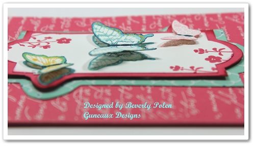
I think the butterflies in the above picture of the card appear to be hovering over the card with their shadow showing underneath.  I have to give the credit for the effect to my camera (lol).  Oh, wait….maybe it was the person behind the camera creating the effect.  Regardless, I think those wonderful Stampin’  Dimensionals (104430 – catalog item number) played a role as well!  Don’t you just love the 3-D effect on greeting cards?

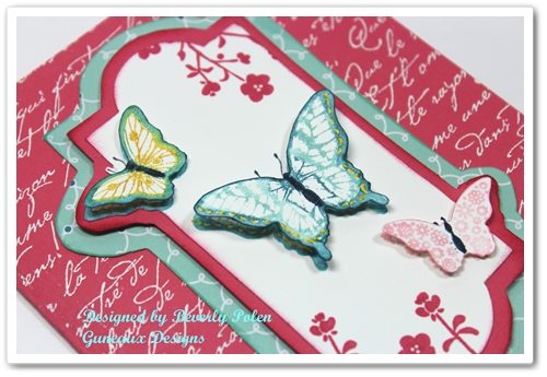
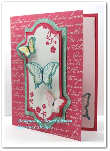
Look closely at the layers on the card.  You also may want to look at the card front in the picture below.  It appears as though I cut out the pieces using a framelit from the Apothecary Accents Framelits (127003 – catalog item number).  Well, my framelit doesn’t have the two “bump outs” on it, does yours?

I did use the framelit from the Apothecary Accents, but I did not use it to cut out the paper that forms the layers.

How often do you start making a card with one intent and then the card ends up being completely different?  That’s what happened on my card.

I first stamped the butterflies from the Papillon Potpourri Stamp Set onto a 3-1/2″ x 4-3/4″ piece of Whisper White Card Stock.  I had planned to add some other elements to that piece of card stock, but then I wasn’t happy with it.

I wondered if I had a framelit that would fit around the butterflies, and if so, I would use that to cut out the piece.  Well, the framelits that I have are either too big or small.  As usual, I didn’t let that defeat me.  I wanted to use the Apothecary Accents framelit, so I decided to lay it around the butterflies and trace around the inside with a pencil.  I couldn’t trace across the two small butterflies, so I decided to go around them.  I “fussy cut” out the framelit, which resulted in the two bump outs.  You needed to know all of this, right?

I then traced the outside of the framelit onto a piece of Strawberry Slush Card Stock, allowing for the bump outs.  As for the bottom layer that is the Pool Party design from the Quatrefancy Specialty Designer Series Paper (130141), I free-handed it.

Notice the little flowers at the top right and bottom left of the Whisper White Card Stock.  They are from a stamp in the Hostess Morning Meadow Stamp Set.

I hope you enjoyed the card and my rambling.  You can leave a comment by clicking on the “chat bubble” at the right of the post’s title.  I love to get comments! 


God’s Blessings!
Stamping With Guneaux Designs
by
Beverly Polen

 PAPILLON POTPOURRI STAMP SET – STAMPIN’ UP!

Stampin Up Paper Purse and Cards – Gingham Garden DSP

I have a cutie for you today; a Stampin Up Paper Purse and matching cards made with the  new Gingham Garden Designer Series Paper (129310).  I have noticed a lot of up-scale stores offering pink purses, so I decided the Gingham Garden DSP would be perfect for this Stampin Up Paper Purse.

  Stampin Up Paper Purse Gingham Garden DSP

The design for this paper purse is one that I developed back in 2011. You can see that purse here.

These are the three 3″ x 3″ “Thank You” greeting cards with matching envelopes.  The cards match the Stampin Up Paper Purse.

Stampin Up Paper Purse and Cards

 Stampin Up Paper Purse and Cards - Gingham Garden DSP

This picture is of the Stampin Up Paper Purse’s fastener that is made with the Daffodil Delight and floral design from the Gingham Garden DSP.  (Personally, I think the color is closer to So Saffron.)  I used a paper piercer around the edges of the fastener and stitched  a blue embroidery thread around it.  I topped it off with a Spring Catalog Designer Builder Brad.  Attached to that brad is a Midnight Muse In Color Dahlia (127556).

Stampin Up Paper Purse and Cards - Gingham Garden DSPTo the right is a picture of the back of the purse.  You can see the back of the fastener as well as the two side embellishments that extend to the front.  They are made with the Daffodil Delight and floral design from the Gingham Garden DSP and Primrose Petals In Color Dahlias.

The 3″ x 3″ matching “Thank You” greeting cards fit perfectly into the opening of the purse.  I made three of the cards; however, I could easily fit six inside the Stampin Up Paper Purse. 

 Stampin Up Paper Purse

 Individual pictures of the greeting cards that match the Stampin Up Paper Purse

Stampin Up Paper Purse and Cards 

This card features the new Gingham Garden Designer Washi Tape (129314).  I’ve not used washi tape before, and I must say I really like Stampin’ Up!’s.   Also featured are flowers from the Stampin’ Up!’s Boho Blossoms Punch (119858).


 Stampin Up Paper Purse and Matching Card


The primary features on this card are the Gingham Garden Designer Series Paper and the Boho Blossoms Punch flowers.


 Stampin Up Paper Purse and Matching Card

Stampin’ Up! products featured on this card are the Dotted Scallop Ribbon Border Punch (119275), 1″ Square Punch (124094), 1-1/4″ Square Punch (retired), Bitty Butterfly Punch (129406), and Gingham Garden DSP.  

Enjoy!


God’s Blessings!
Stamping With Guneaux Designs
by
Beverly Polen 
 Stampin Up Paper Purse and Matching Cards

STAMPIN UP PAPER PURSE, MATCHING CARDS, AND GINGHAM GARDEN DSP

Color On Color Emboss Resist Technique – Happy Father’s Day

I love the art of blending inks. However, I had not tried before the Color on Color Emboss Resist Technique. After trying it, I now know that I really, really like it and will be using it in future art. The card share I have for you today features this technique for a Happy Father’s Day card.

Color on Color Emboss Resist Technique

SUPPLIES USED FOR THE COLOR ON COLOR RESIST TECHNIQUE, HAPPY FATHER’S DAY CARD (I am listing the supplies I used; however, the supplies you use do not need to be the same, as it is the technique itself that is the subject of this tutorial).

Stamp Sets: Stampin’ Up! Fine Feathers (126517) and an old hostess stamp set, Something to Celebrate (for sentiment)

Paper: Baked Brown Sugar Card Stock (131296), Bermuda Bay Card Stock (131197), and Whisper White Card Stock (100730)

Ink: You will need three light colors and one darker color – Pistachio Pudding Classic Ink (131177), More Mustard Classic Ink (retired), Coastal Cabana Classic Ink (131175), and Baked Brown Sugar Classic Ink (131174)

Accessories: Embossing Buddy (103083), Ovals Collections Framelits (129381), Bitty Banners Framelits (129267), Sponge Daubers (102892), VersaMark (102283), Clear Embossing Powder (109130), Linen Thread (104199), Stampin’ Dimensionals (104430)

Color on Color Emboss Resist Technique

INSTRUCTIONS FOR THE COLOR ON COLOR EMBOSS RESIST TECHNIQUE:

1. Cut card stock accordingly:

8-1/2″ x 5-1/2″ for card base

5-1/4″ x 4″ for 1st layer

5″ x 3-3/4″ of Whisper White Card Stock

2. Select a stamp that you want to be the main feature of the card. (I used the feather stamp; however, I think it would work best with a solid stamp with few designs within).

3. Select three colors of classic ink that are light shades.

4. Using a sponge dauber, swirl your first light color onto the Whisper White Card Stock.

Color on Color Emboss Resist Technique

5. Swirl your second light color onto the Whisper White Card Stock, and don’t worry about overlapping the colors.

Color on Color Emboss Resist Technique

6. Swirl your third light color onto the Whisper White Card Stock, and then look for places where you want to blend the colors and do that with the daubers. Don’t worry about the look too much as it will completely change when you add the darker color.

Color on Color Emboss Resist Technique

7. AFTER the ink dries, rub the embossing buddy over the complete piece of card stock.

8. Cover your selected stamp with VersaMark and stamp the image randomly on the card stock.

9. Cover with the clear embossing powder and heat set. Let it cool.

10. Swirl you dark color of ink all over the piece of card stock. You may need to do this a couple times or more.

11. Using a paper towel, rub the excess dark ink from the embossed images. Isn’t it cool how the clear embossing takes on the colors?

12. After reaching the desired colors on the colored piece of card stock, use the stamp image to create a center piece for the card.

Color on Color Emboss Resist Technique

13. Adhere the pieces together and add your desired embellishments.

14. Add your sentiment to the card.

Enjoy!!

God’s Blessings!
Stamping With Guneaux Designs
by
Beverly Polen

Color on Color Emboss Resist Technique COLOR ON COLOR EMBOSS RESIST TECHNIQUE – HAPPY FATHER’S DAY

Quatrefancy Designer Series Paper and Mosaic Madness Stamp Set

Quatrefancy Designer Series Paper and Mosaic Madness Stamp Set

What do you think of the new Stampin’ Up! Quatrefancy Designer Series Paper and Mosaic Madness Stamp Set?

I am excited about both of these new products, which I have featured on my card share today.  Three paper designs from the Quatrefancy Designer Series Paper (130141) and one stamp from the Mosaic Madness Stamp Set (130249) were used on the card.  Also featured is the new Stampin’ Up! Modern Mosaic Embossing Folder (129984).

Quatrefancy Designer Series Paper and Mosaic Madness Stamp Set

The colors of the designs from the Quatrefancy Designer Series Paper and Mosaic Madness Stamp Set stamp images on the card are Stampin’ Up!’s Pool Party, Island Indigo, Strawberry Slush (doesn’t that name sound yummy?), and Whisper White.  The Strawberry Slush is a new “In-Color”.

I embossed the piece of Whisper White Card Stock with the new Stampin’ Up! Mosaic Madness Embossing Folder. To add color to the raised parts of the embossing, I did something different from what you will read on other websites, etc.  After embossing the paper, I used a Pool Party Classic Ink Pad (the old type of pad) and gently swiped the raised embossed sections until I got the desired effect.  I tried this with a new foam pad and it didn’t work at all as it was too soft (because of the foam) and inky.

After allowing the ink to dry, I stamped an image from the Mosaic Madness Stamp Set over three of the mosaic patterns.  Inside these images I stamped the words “Love You” and wrote the word “I”.  The “love you” words are from the Stampin’ Up! Fabulous Phrases Stamp Set (120501).    Quatrefancy Designer Series Paper and Mosiac Madness Stamp Set

Now let’s move on to the card’s left side and the ribbon covering the top layer of the Quatrefancy Designer Series Paper.   Wait, is that “ribbon”?  Hummm – well, actually it is many threads that I unraveled from a piece of Island Indigo ribbon.  Yes, it’s time consuming, but I enjoy the look of the shinny threads.  The bow was made also with the threads.

What are your thoughts about the threads and bow?

The following is a closeup of the card’s right side, which I explained above. Quatrefancy Designer Series Paper and Mosiac Madness Stamp Set

However, I didn’t mention above that I pierced the top and bottom corners of the embossed Whisper White piece of card stock.  I also added two Island Indigo patterned brads, which have retired. 🙁  I have so many retired Stampin’ Up! brads; therefore, I choose to use them whenever I can.

TIP:  OK, so we know that the Quatrefancy Designer Series Paper and Mosaic Madness Stamp Set coordinate with the Mosaic Punch.  But did you know that some designs in the Quatrefancy Designer Series Paper coordinates with the Itty Bitty Shapes Punch Pack (118309)? Itty Bitty Shapes Punch Pack Look closely at the designs and you’ll see what I mean!

I wanted to give you a closeup of the bow.  Now trying to tie multiple threads together was a tough task, but I managed.

Quatrefancy Designer Series Paper and Mosaic Madness Stamp Set


I hope you enjoyed the card!


God’s Blessings!
Stamping With Guneaux Designs
by
Beverly Polen

 Quatrefancy Designer Series Paper and Mosiac Madness Stamp Set

Quatrefancy Designer Series Paper and Mosaic Madness Stamp Set

Soho Subway Designer Series Paper – Happy Birthday Card

Soho Subway Designer Series PaperThe new Stampin’ Up! Soho Subway Designer Series Paper  (DSP)  (130140) is featured on this Happy Birthday card. 

Soho Subway Designer Series Paper

The design used on the card is my favorite of the designs within the DSP.  The colors for the Soho Subway Designer Series Paper are Crisp Cantaloupe (a new color), Early Express, Island Indigo, Summer Starfruit, and Very Vanilla.

The card base is a piece of the new Crisp Cantaloupe Card Stock (In Color – 131298), and the second layer is a piece of the new Baked Brown Sugar Card Stock (In Color – 131296).  The third layer is the Subway Designer Series Paper design.

I made this card for a very special friend, Lin, for her recent birthday.  The sentiment, “Happy Birthday to you!” is from the new Label Love Stamp Set (130622 – clear).  Label Love Stamp SetThis stamp set matches a new punch, the Artisan Label (130920).

 Artisan Label Punch


The top portion of the card spotlights a butterfly from the Papillon Potpourri Stamp Set (123759 – clear).  You will note that the butterfly is two different ink colors; Crisp Papillon Potpourri Clear-Mount Stamp SetCantaloupe Classic Ink (a new In Color – 131176) and Baked Brown Sugar Classic Ink (another new In Color -131174).  I used the Rock and Roll Technique with the stamp image before stamping it onto Very Vanilla Card Stock.

The mats for the image were made with the Window Frames Collection Framelits (129021), using the Crisp Cantaloupe Card Stock and the design from the Soho Subway Designer Series Paper.  This picture is a closeup of the butterfly and mats.

Soho Subway Designer Series Paper

As stated above, the sentiment is from the Label Love stamp set.  It is matted with Baked Brown Sugar Card Stock.  The bow that rests above the sentiment is an old Stampin’ Up! ribbon that matches perfectly with the Crisp Cantaloupe Card Stock.  It is the old Groovy Guava Double Stitched Ribbon.   This picture is a closeup of the ribbon and sentiment.

 Soho Subway Designer Series Paper

 This is a picture of the card’s inside, which features the Papillon Potpourri Stamp Set. 

 Papillon Potpourri Stamp Set

ENJOY!
 
Stamping With Guneaux Designs 
 
God’s Blessings!
Stamping With Guneaux Designs
by
Beverly Polen 

Soho Subway Designer Series Paper

Stampin’ Up! Soho Subway Designer Series Paper